Here at Aspire Doors, we stumbled across something amazing. We help people achieve their interior design dreams with our fantastic products, like our
exterior bi-folding doors, which can completely revolutionise your home. Because of the products we sell, we like to keep on top of interior design trends and so on to see how our stock can stay relevant, modern and help our customers achieve cutting-edge, forward-thinking designs.
Part of keeping up to date with interior design is eagerly awaiting the esteemed
Pantone Colour of the Year. Beginning in 2000, this annual tradition has cemented Pantone as the authority on all things colour.
Pantone itself was founded in 1962 as manufacturers of colour cards intended to be used by cosmetic companies. Colour swatching is now an important part of many different creative and commercial fields and Pantone certainly contributed to that when they changed direction and established their colour matching system in 1963.
Since 1963, Pantone’s colour matching system (PMS) has done wonders to further their brand voice and identity. The PMS has created a kind of standardised ‘dictionary’ of colours that can be used across projects around the world. The Colour of the Year was a hit from its first year in 2000 and continues to bolster its brand today.
Before we go into our ground-breaking discovery, let’s take a closer look at the Pantone Colour of the Year…
How is the Pantone Colour of the Year Decided?
Pantone take into account numerous factors when calculating the Colour of the Year. They take fashion, politics, product packaging, media, film, the arts, current popular travel destinations, product & industrial design, to name just a few. The colours they choose generally relate to the zeitgeist and socio-economic conditions of the moment.
Pantone will host secret meetings twice a year in various European capitals with colour representatives from around the world. Behind these secret closed doors, they will discuss and debate what the colour of the year should be. These are also decided in advance; Pantone are certainly ahead of the curve in that respect.
Our Discovery
Pantone announced their Colour of the Year for 2019. They chose ‘
Living Coral’. Their official website says it is a “life-affirming coral hue with a golden undertone that energises and enlivens with a softer edge”. It really is a gorgeous colour and upon looking down the previous champions to 2010, we noticed something amazing…
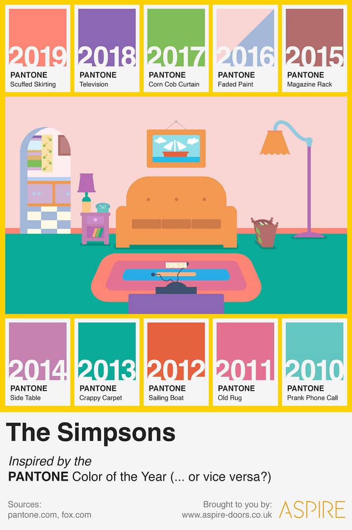
The Colour of the Year from 2010 to 2019 are all to be found and easily observed in… the iconic living room of
The Simpsons family!

That’s right – is this proof that Pantone have just been phoning it in since 2010 and these secret meetings are actually just Simpsons marathons?
The Evidence
Let’s begin with Pantone’s Colour of the Year for 2013:
Emerald. This hue is also the colour of the Simpsons’ carpet. In 2016, Pantone made history by selecting two shades for Colour of the Year:
Serenity and
Rose Quartz. Mix these together and you get the colour of the walls in the Simpsons’ living room.
2019’s Living Coral matches the skirting boards, 2018’s
Ultra Violet is the colour of their television, going all the way back to 2010 where Pantone’s Colour of the Year –
Turquoise – matches the colour of their telephone. From the magazine rack to the side table, rug and curtain, they all match up.
Considering the Simpsons started way back in 1989, this surely can’t be a coincidence, which begs the question…
Is Matt Groening a Time Traveller?
This discovery will undoubtedly add further fuel to the fire that Matt Groening, the creator of The Simpsons, is in fact a time traveller. That might sound crazy, but hear us out…
This isn’t a new theory. ‘Nostragroening’ has been accused of time travel after The Simpsons successfully predicted multiple events that didn’t take place until years after the respective episodes aired.
The Tin Foil Hat Club say he knows all this because he’s a Freemason. Considering that all you have to do is ask and pay an annual fee to be a Freemason, we won’t be putting on our hats just yet.
But this doesn’t stop the fact that The Simpsons have been strangely accurate with their ‘predictions’.
What have The Simpsons Predicted Correctly?
The Simpsons now have quite an impressive list of future predictions. Here are some of the major examples:
- In 2000, the episode ‘Bart to the Future’ depicted Donald Trump as president, creating a national crisis. This was shared widely in Trump’s presidential campaign in 2016. No one’s laughing anymore.
- The Siegfried & Roy Tiger attack – The Simpsons parodied the Las Vegas act Siegfried & Roy with their own Gunter & Ernst. Gunter & Ernst get mauled by a tiger in the show, which happened to the real life Siegfried & Roy ten years later.
- In the ‘Bart to the Future’ episode, Lisa and Marge talk using video call technology like Skype or FaceTime. In fairness, it didn’t take a genius to figure out that that would eventually become possible.
- In a 1995 episode, the Simpsons time travel again to the year 2010. People are using smartwatches. Another prediction that has now come true. Again, this wasn’t exactly a huge stretch; smartwatches were depicted in many other programmes and films way before their release.
- In 1997, The Simpsons made a reference to an outbreak of Ebola, which very sadly was an issue that dominated the year 2014.
- In a 2010 episode, Milhouse wagered that MIT Professor Bengt Holmstrom would win a Nobel Prize. He won a Nobel prize in 2016. Coincidence?
- Walt Disney acquiring Fox, which happened in late 2017. This was a ground-breaking deal that is set to change the face of US media.
- Another 2010 episode depicts Homer & Marge as a mixed doubles curling team. They come from behind to beat Sweden at the Winter Olympics. At the 2018 Winter Olympics, the USA men’s team came from behind to beat Sweden for a medal.
- In a 2012 episode, a character that looks a lot like Lady Gaga is seen being lifted down in a harness wearing a glittery silver outfit to entertain the residents of Springfield. Fast forward to 2017, when Lady Gaga, who looks a lot like Lady Gaga, descends from the roof of the NRG Stadium wearing a glittery silver outfit for the Superbowl Halftime Show.
- The Simpsons Movie from 2007 depicted the NSA as a mass-surveillance agency that listened in to every phone call and watched civilians everywhere. This was confirmed by the whistle-blower Edward Snowden in 2013. However, it was quite well known the US government were conducting mass surveillance, it had just never been confirmed.
- The FIFA corruption scandal. Again, anyone with eyes could see that FIFA was/is a deeply corrupt organisation. The Simpsons aired an episode in 2014 about corruption in football and in 2015, the FIFA corruption scandal was front-page news, with arrests being made. Again, any football fan in the world could’ve told you that FIFA was and still is corrupt.
- ‘Europe Puts Greece on Ebay’. This was a ticker that ran across the screen when Homer appears on a news programme in a 2012 episode. In 2015, Greece did default on their debts to the EU and the ticker pretty much rings true now. You didn’t have to be a clairvoyant to see this coming though.
- Autocorrect failures. In a 1994 episode, one of the school bullies is seen using an Apple device to make a note to ‘Beat up Martin’. This is autocorrected to ‘Eat up Martha’. Anyone with an Apple device knows the necessary evil that is AutoCorrect.
- The most eerie future prediction, the one that will really make you say ‘hmmm’, is when Homer predicts the mass of the Higgs Boson or ‘God Particle’ in 1998. 14 years before scientists at CERN built and used their Large Hadron Collider to prove the existence of the Higgs Boson, arguably one of the biggest scientific discoveries of all time, Homer Simpson can be seen at a blackboard writing an equation that accurately predicts the mass of the God Particle.
- The Pantone Colours of the year from 2010 to 2019 – the latest addition to the list.
Admittedly, some of the above predictions could be made by anyone that pays attention to the news, but some of them are
so much of a coincidence that it makes you question everything.
Is the colour scheme of the Simpsons living room a blind coincidence, or the smoking gun that reveals Groening to be a time traveller after all? Did Pantone stop using the ‘zeitgeist’ to decide their Colour of the Year in 2010 and instead just pointed to a different part of the Simpsons living room? Who knows? All we know is that we may have gotten quite carried away by this discovery.
 That’s right – is this proof that Pantone have just been phoning it in since 2010 and these secret meetings are actually just Simpsons marathons?